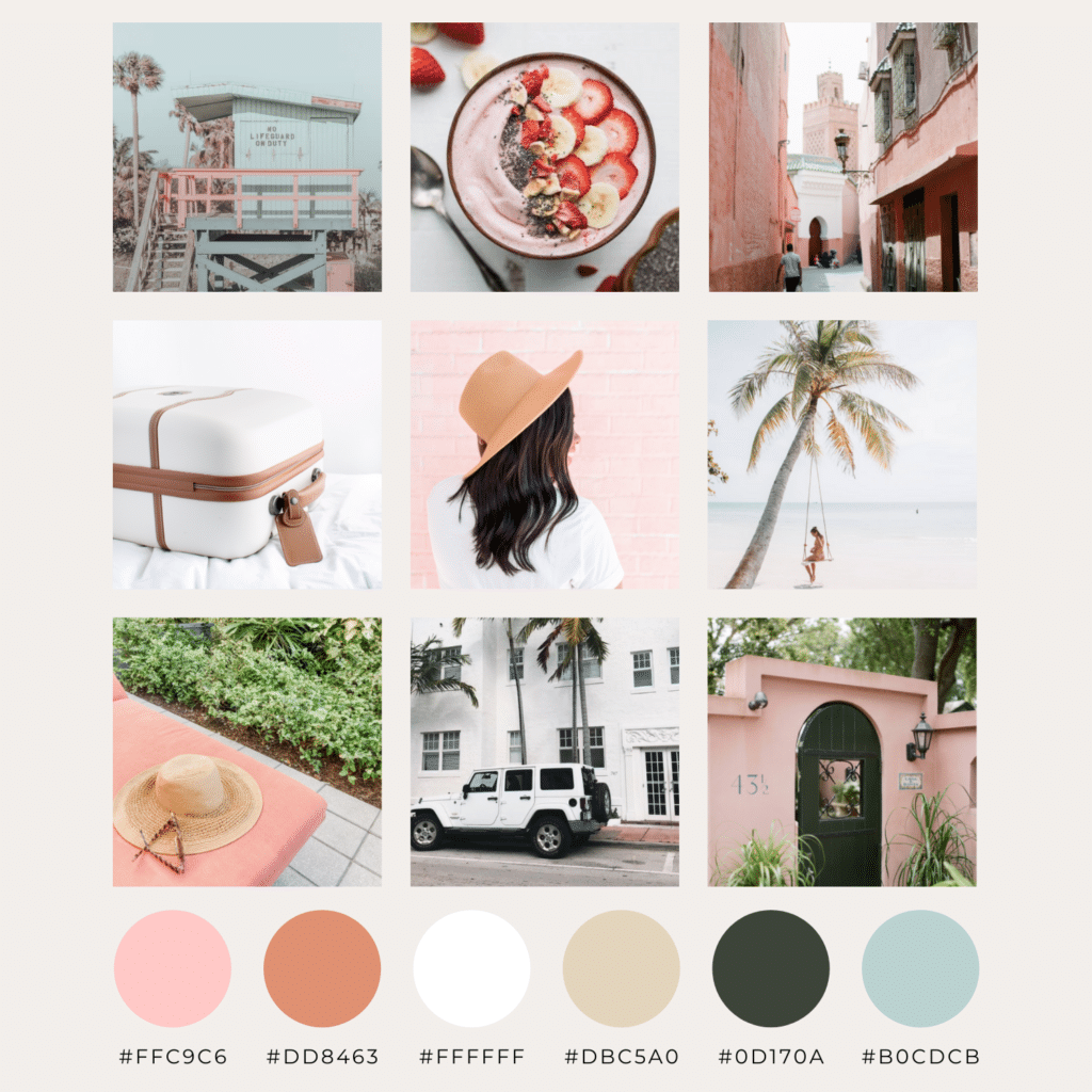
With Valentine’s Day right around the corner, I couldn’t help but create a pink-focused moodboard!
Let me just put this out there…I am not usually one to throw pink and blue in a color palette together. In their truest forms, one can easily overpower the other. But as we can see in this moodboard, the tinted colors prove a beautiful pair!
If you find your colors to be too intense or bright, tint (add white to) or shade (add black to) them. This not only creates even more colors for you to work with, but enables a more unique and refined brand image.
You might wonder how adding stark white to your brand’s color palette would affect your image. I mean how much can plain ole WHITE do for my brand? It can actually be a great addition! White brings notes of cleanliness, freshness and simplicity to your brand. In today’s world, these attributes can make all the difference when it comes to being successful.
To all the colorful creativity and wherever this long Valentine’s Day weekend takes you…
xo,
Deena