Pantone’s Color of the Year 2021 is Illuminating yellow, paired with Ultimate Gray.
“Practical and rock solid but at the same time warming and optimistic, the union of PANTONE 17-5104 Ultimate Gray + PANTONE 13-0647 Illuminating is one of strength and positivity. It is a story of color that encapsulates deeper feelings of thoughtfulness with the promise of something sunny and friendly.” – Pantone.com
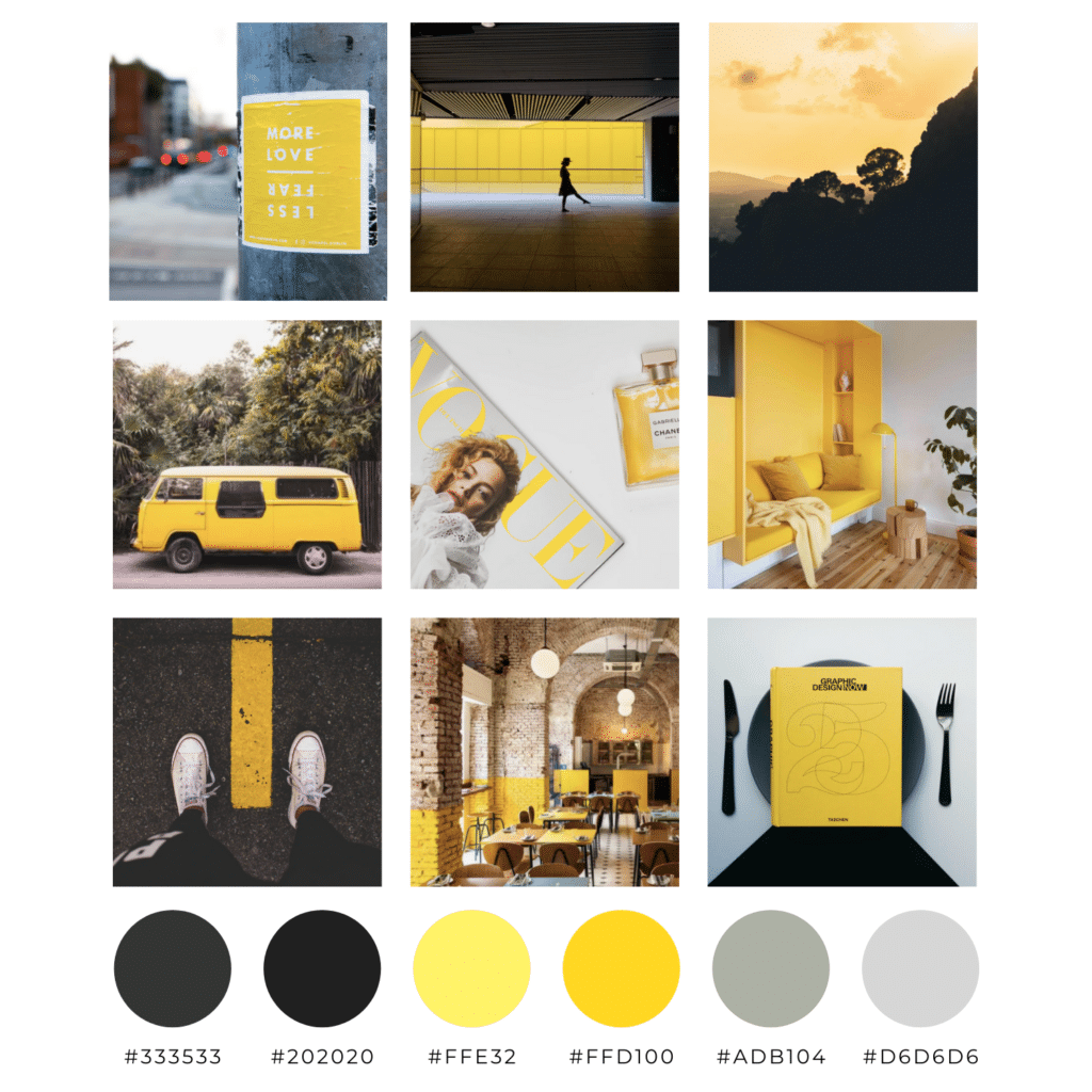
At first, yellow might seem like an intimidating color to embrace in a color palette, but I want to explain how you can incorporate bright, adventurous colors while still maintaining a clean, professional look.
Your overarching color palette should consist of both action (“Click here!”) colors and neutral (background, elements) colors. Your action colors should convey the emotions/vibes you want your viewers to feel. According to color psychology, yellows & oranges are cheerful and evoke positive thoughts; blues promote feelings of trust and security; and purple tones are associated with wisdom and respect.
If you want to explore new looks with your branded content, altering the transparency or intensity of an action color can be a great starting place! Using a more intense version of one (or a couple) of your brand colors will add variety to your brand while not swaying away entirely.
A great place you can go to explore unique color pairings and popular/trending color palettes is Coolors.co .
Here’s to trying new things & adding pops of color to our lives!
xo,
Deena